Beautiful Plots with Matplotlib
Author: Quentin Fournier (edited with LLMs)
At their best, graphics are instruments for reasoning about quantitative information. Often, the most effective way to describe, explore, and summarize a set of numbers - even a very large set - is to look at pictures of those numbers. – Edward Tufte
Data visualization is both an art and a science. A well-designed plot can illuminate insights and convey complex information in a way that raw numbers never could. But a cluttered or misleading graphic can do more harm than good. The goal is clarity and impact.
This guide provides simple, aesthetic examples of common plot types using Matplotlib and Seaborn. These aren’t rigid templates but rather starting points for you to adapt to your own data and narrative.
Ultimately, it is content that makes graphics interesting. When a chart is presented properly, information just flows to the viewer in the clearest and most efficient way. – Dona M. Wong
Let’s dive into some practical examples with dummy data.
Color Map
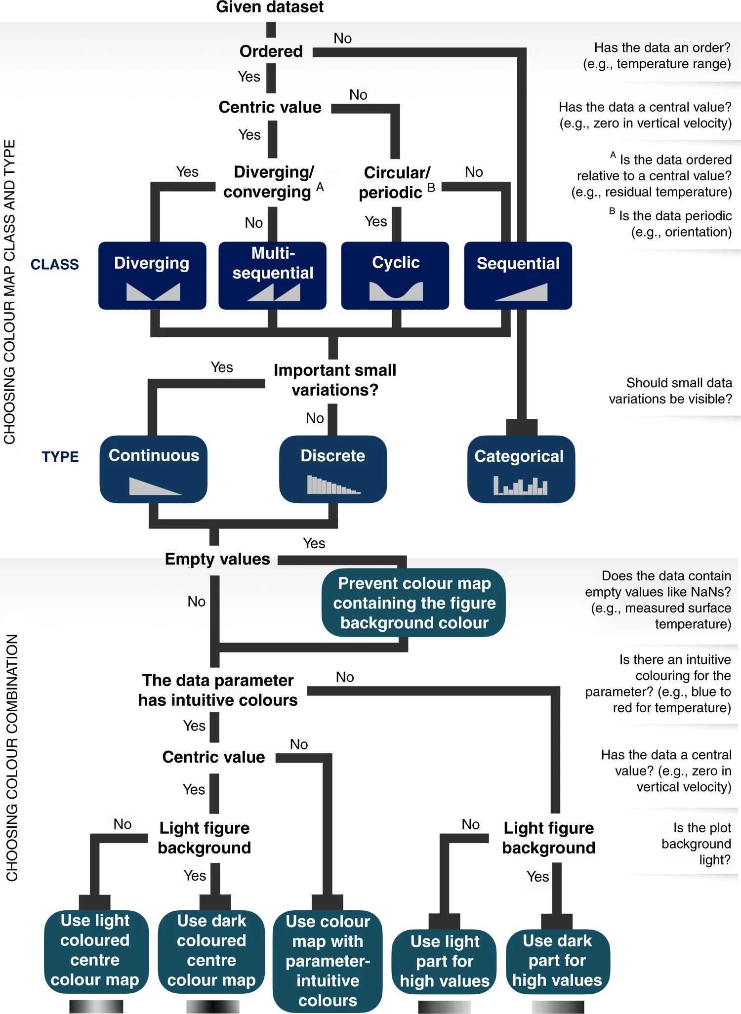
From The misuse of colour in science communication (Fabio Crameri et al, 2020) published in Nature Communications:
The accurate representation of data is essential in science communication. However, colour maps that visually distort data through uneven colour gradients or are unreadable to those with colour-vision deficiency remain prevalent in science. These include, but are not limited to, rainbow-like and red–green colour maps. Here, we present a simple guide for the scientific use of colour.
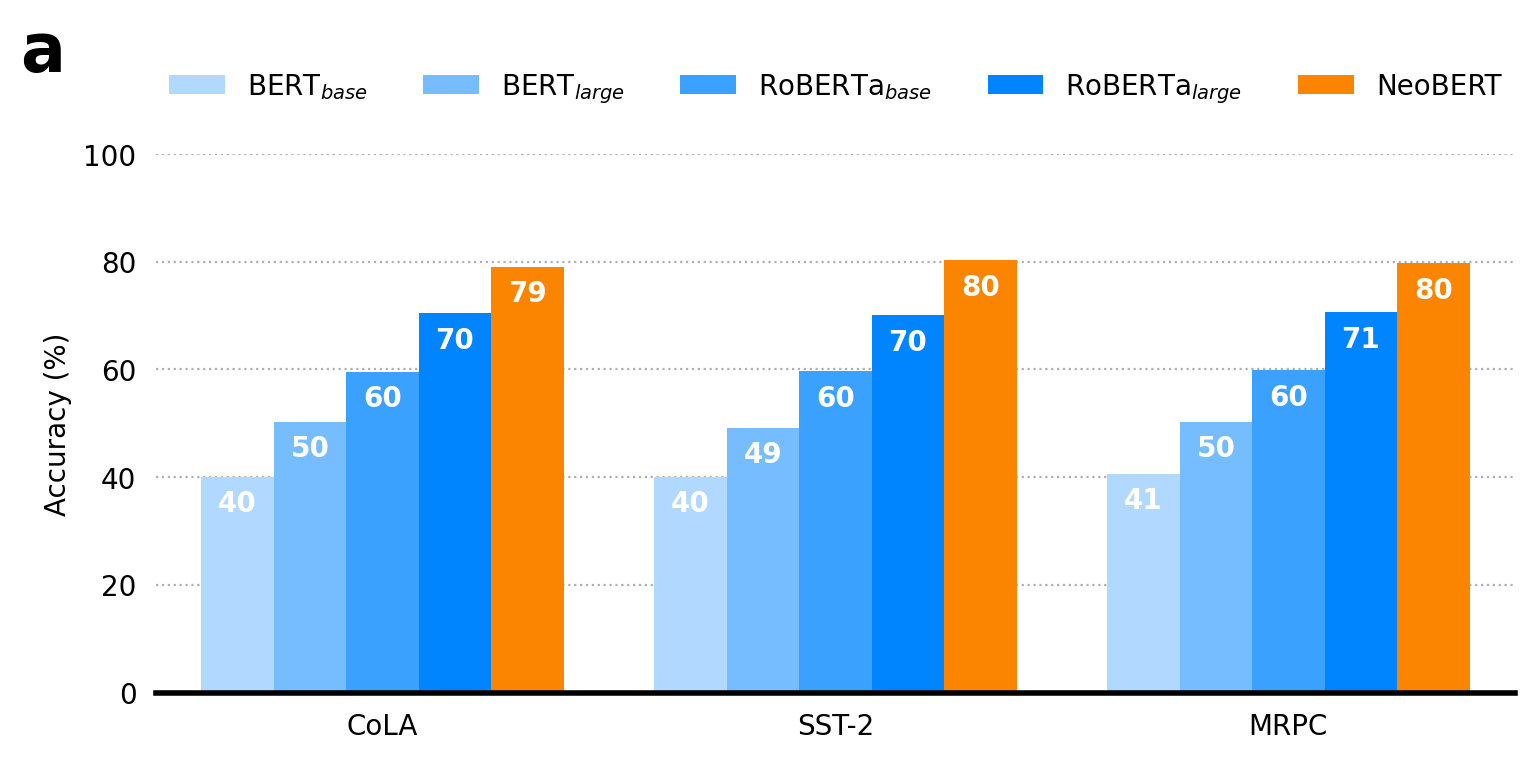
The Classic Bar Plot
Bar plots are perfect for comparing discrete categories. A golden rule is that bar plots must start at 0 on their value axis to provide an accurate, non-misleading comparison of values. Here, we’ll create a grouped bar plot to compare model scores across different benchmarks.
import numpy as np
import pandas as pd
import seaborn as sns
import matplotlib.pyplot as plt
from matplotlib.patches import Patch
from matplotlib.lines import Line2D

# --- Style and Color Configuration ---
# Display figures in higher quality for notebooks
%config InlineBackend.figure_format='retina'

palette = {
    r'BERT$_{base}$': "#b1d9ff",
    r'BERT$_{large}$': "#76bdff",
    r'RoBERTa$_{base}$': "#3ba1ff",
    r'RoBERTa$_{large}$': "#0085ff",
    "NeoBERT": "#fb8500",
    "Win": "#fb8500",
    "Tie": "#909090",
    "Loss": "#0085ff",
}

# --- Generate Main Results DataFrame ---
# This DataFrame simulates multiple runs of different models on various benchmarks.
data = {"Model": [], "Benchmark": [], "Score": [], "Run": []}
models = [r'BERT$_{base}$', r'BERT$_{large}$', r'RoBERTa$_{base}$', r'RoBERTa$_{large}$', "NeoBERT"]
benchmarks = ["CoLA", "SST-2", "MRPC"]
for i, model in enumerate(models, 1):
    for benchmark in benchmarks:
        # Simulate scores for 500 runs per experiment
        scores = np.random.normal(loc=i * 10 + 30, scale=8, size=500)
        data["Score"].extend(scores)
        data["Model"].extend([model] * 500)
        data["Benchmark"].extend([benchmark] * 500)
        data["Run"].extend(range(500))
df_results = pd.DataFrame(data)

# --- Create the Figure ---
fig, ax = plt.subplots(1, 1, figsize=(8, 4), tight_layout=True)

# Plot the data using seaborn's barplot, which automatically calculates the mean.
sns.barplot(
    data=df_results,
    x="Benchmark",
    y="Score",
    hue="Model",
    palette=palette,
    saturation=1.0,
    ax=ax,
    errorbar=None # CIs are shown in the next plot
)

# --- Add Bar Labels ---
# Add text annotations for the score on each bar.
for rect in ax.patches:
    if rect.get_height() > 10.0:
        mean_score = rect.get_height()
        ax.text(
            rect.get_x() + rect.get_width() / 2.0,
            mean_score - 5,
            f"{mean_score:.0f}",
            fontsize=10, ha="center", va="center", color="white", weight='bold'
        )

# --- Styling & Customization ---
ax.set_xlabel("")
ax.set_ylabel("Accuracy (%)")
ax.set_ylim(0, 100)
ax.set_yticks([0, 20, 40, 60, 80, 100])
ax.tick_params(left=False, bottom=False)
ax.spines[["top", "right", "left"]].set_visible(False)
ax.spines["bottom"].set_linewidth(2)
ax.yaxis.grid(True, which="major", linestyle=":")
ax.set_axisbelow(True)
ax.legend(loc='upper center', bbox_to_anchor=(0.5, 1.2), ncol=5, frameon=False)
ax.text(-0.1, 1.25, "a", fontsize=24, fontweight="bold", ha="left", va="top", transform=ax.transAxes)

# --- Save the Figure ---
plt.savefig("bar_plot.png", bbox_inches="tight", dpi=300, transparent=True)
plt.savefig("bar_plot.pdf", bbox_inches="tight", transparent=True)
plt.show()
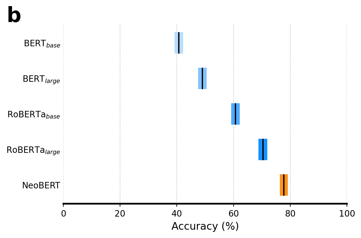
Horizontal Bar Plot with Confidence Intervals
This plot takes our comparison a step further by showing model performance with 95% confidence intervals (CIs). We calculate these CIs using bootstrapping, a powerful resampling technique that estimates the uncertainty of a statistic (like the mean) without making strong assumptions about the data’s distribution.
import numpy as np
import pandas as pd
import seaborn as sns
import matplotlib.pyplot as plt
from scipy import stats
from matplotlib.patches import Patch
from matplotlib.lines import Line2D

# --- Style and Color Configuration ---
# Display figures in higher quality for notebooks
%config InlineBackend.figure_format='retina'

palette = {
    r'BERT$_{base}$': "#b1d9ff",
    r'BERT$_{large}$': "#76bdff",
    r'RoBERTa$_{base}$': "#3ba1ff",
    r'RoBERTa$_{large}$': "#0085ff",
    "NeoBERT": "#fb8500",
    "Win": "#fb8500",
    "Tie": "#909090",
    "Loss": "#0085ff",
}

# --- Generate Main Results DataFrame ---
# This DataFrame simulates multiple runs of different models on various benchmarks.
data = {"Model": [], "Benchmark": [], "Score": [], "Run": []}
models = [r'BERT$_{base}$', r'BERT$_{large}$', r'RoBERTa$_{base}$', r'RoBERTa$_{large}$', "NeoBERT"]
benchmarks = ["CoLA", "SST-2", "MRPC"]
for i, model in enumerate(models, 1):
    for benchmark in benchmarks:
        # Simulate scores for 500 runs per experiment
        scores = np.random.normal(loc=i * 10 + 30, 30, size=500)
        data["Score"].extend(scores)
        data["Model"].extend([model] * 500)
        data["Benchmark"].extend([benchmark] * 500)
        data["Run"].extend(range(500))
df_results = pd.DataFrame(data)

# --- Data Preparation & Bootstrap ---
# This plot uses the raw scores from `df_results` to bootstrap CIs.
bootstrap_results = {}
for model_name in models:
    # Filter scores for the current model (we average across benchmarks for simplicity).
    scores = df_results[df_results["Model"] == model_name]["Score"].to_numpy()
    # Bootstrap the mean statistic. The data must be passed as a sequence, hence (scores,).
    res = stats.bootstrap((scores,), np.mean, confidence_level=0.95, random_state=42)
    bootstrap_results[model_name] = {
        "mean": scores.mean(),
        "low": res.confidence_interval.low,
        "high": res.confidence_interval.high,
    }

# --- Plotting Setup ---
fig, ax = plt.subplots(figsize=(6, 4), tight_layout=True)
models_reversed = models[::-1]
y_pos = np.arange(len(models))

# --- Create the Plot ---
for i, model_name in enumerate(models_reversed):
    data = bootstrap_results[model_name]
    # Plot the confidence interval as a horizontal bar.
    ax.barh(
        y=y_pos[i],
        width=data["high"] - data["low"],
        left=data["low"],
        height=0.6,
        color=palette[model_name],
        alpha=0.9,
        edgecolor=None,
    )
    # Add the mean value as a vertical black line.
    ax.vlines(
        x=data["mean"],
        ymin=y_pos[i] - 0.3, ymax=y_pos[i] + 0.3,
        color="black", linewidth=1.5,
    )

# --- Aesthetics and Customization ---
ax.set_yticks(y_pos, models_reversed)
ax.tick_params(axis="y", length=0)
ax.xaxis.grid(True, which="major", linestyle=":")
ax.set_axisbelow(True)
ax.spines[["top", "right", "left"]].set_visible(False)
ax.spines["bottom"].set_linewidth(2)
ax.set_xlim(0, 100)
ax.set_xlabel("Accuracy (%)", fontsize=12)
ax.text(-0.2, 1.1, "b", fontsize=24, fontweight="bold", ha="left", va="top", transform=ax.transAxes)

# --- Save the Figure ---
plt.savefig("horizontal_bar_plot.png", bbox_inches="tight", dpi=300, transparent=True)
plt.savefig("horizontal_bar_plot.pdf", bbox_inches="tight", transparent=True)
plt.show()
Histograms for Distribution Comparison
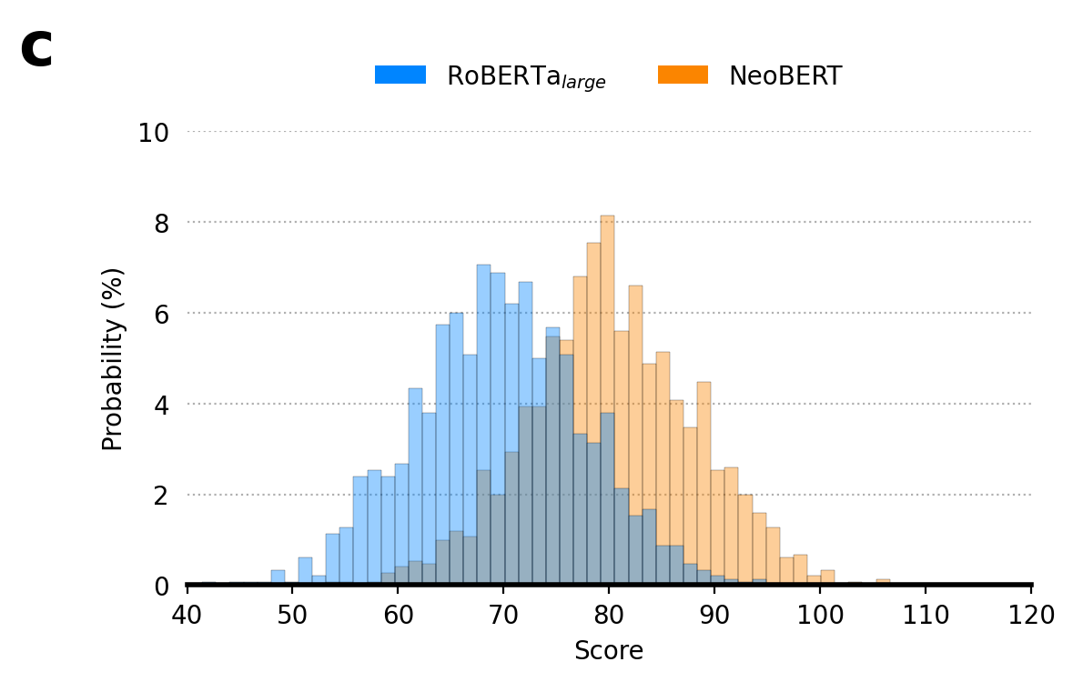
Histograms are excellent for visualizing the distribution of continuous data. They show the frequency of data points within specific intervals (or “bins”). In this example, we’ll overlay two distributions to compare them directly.
import numpy as np
import pandas as pd
import seaborn as sns
import matplotlib.pyplot as plt
from scipy import stats
from matplotlib.patches import Patch
from matplotlib.lines import Line2D

# --- Style and Color Configuration ---
# Display figures in higher quality for notebooks
%config InlineBackend.figure_format='retina'

palette = {
    r'BERT$_{base}$': "#b1d9ff",
    r'BERT$_{large}$': "#76bdff",
    r'RoBERTa$_{base}$': "#3ba1ff",
    r'RoBERTa$_{large}$': "#0085ff",
    "NeoBERT": "#fb8500",
    "Win": "#fb8500",
    "Tie": "#909090",
    "Loss": "#0085ff",
}

# --- Generate Main Results DataFrame ---
# This DataFrame simulates multiple runs of different models on various benchmarks.
data = {"Model": [], "Benchmark": [], "Score": [], "Run": []}
models = [r'BERT$_{base}$', r'BERT$_{large}$', r'RoBERTa$_{base}$', r'RoBERTa$_{large}$', "NeoBERT"]
benchmarks = ["CoLA", "SST-2", "MRPC"]
for i, model in enumerate(models, 1):
    for benchmark in benchmarks:
        # Simulate scores for 500 runs per experiment
        scores = np.random.normal(loc=i * 10 + 30, scale=8, size=500)
        data["Score"].extend(scores)
        data["Model"].extend([model] * 500)
        data["Benchmark"].extend([benchmark] * 500)
        data["Run"].extend(range(500))
df_results = pd.DataFrame(data)

# --- Create the Figure ---
fig, ax = plt.subplots(1, 1, figsize=(6, 4), tight_layout=True)

# Filter the results DataFrame for the models we want to compare.
hist_df = df_results[df_results["Model"].isin([r'RoBERTa$_{large}$', "NeoBERT"])]

# --- Plot Histogram ---
# `stat="percent"` normalizes the bars to show percentage instead of raw count.
# `common_norm=False` ensures each histogram is normalized independently.
sns.histplot(
    data=hist_df,
    x="Score",
    hue="Model",
    stat="percent",
    alpha=0.4,
    lw=0.1,
    bins=50,
    common_bins=True,
    common_norm=False,
    palette=palette,
    ax=ax,
)

# --- Styling and Customization ---
ax.set_xlabel("Score")
ax.set_ylabel("Probability (%)")
ax.set_ylim(0, 10)
ax.set_xlim(40, 120)
ax.set_yticks([0, 2, 4, 6, 8, 10])
ax.tick_params(left=False)
ax.spines[["top", "right", "left"]].set_visible(False)
ax.spines["bottom"].set_linewidth(2)
ax.yaxis.grid(True, which="major", linestyle=":")
ax.set_axisbelow(True)
ax.legend(
    handles=[Patch(facecolor=palette[r'RoBERTa$_{large}$'], label=r'RoBERTa$_{large}$'), Patch(facecolor=palette["NeoBERT"], label="NeoBERT")],
    loc='upper center', bbox_to_anchor=(0.5, 1.2), ncol=2, frameon=False
)
ax.text(-0.2, 1.25, "c", fontsize=24, fontweight="bold", ha="left", va="top", transform=ax.transAxes)

# --- Save the Figure ---
plt.savefig("histogram.png", bbox_inches="tight", dpi=300)
plt.savefig("histogram.pdf", bbox_inches="tight")
plt.show()
Line Plots for Trends
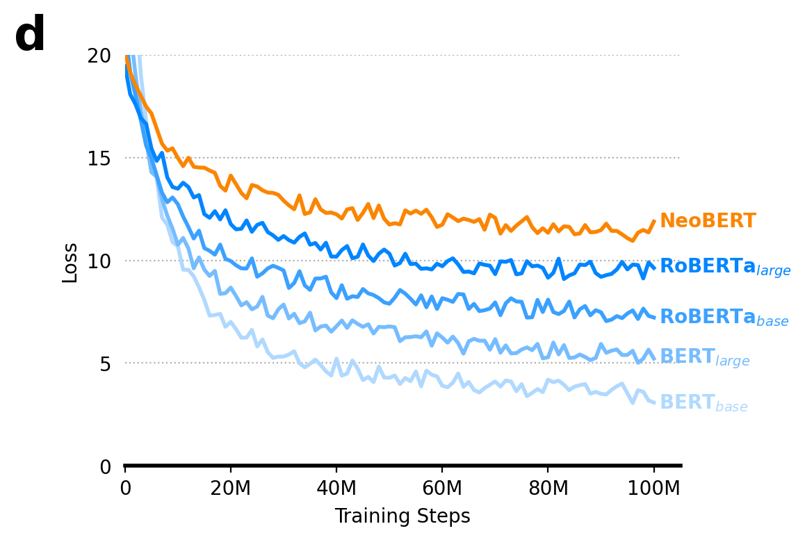
Line plots are the go-to for showing trends over a continuous variable, such as time or, in our case, training steps. This example visualizes the training loss curves for different models. A pro-tip for cleaner line plots is to directly label the lines at the end rather than using a separate legend.
import numpy as np
import pandas as pd
import seaborn as sns
import matplotlib.pyplot as plt
from scipy import stats
from matplotlib.patches import Patch
from matplotlib.lines import Line2D

# --- Style and Color Configuration ---
# Display figures in higher quality for notebooks
%config InlineBackend.figure_format='retina'

palette = {
    r'BERT$_{base}$': "#b1d9ff",
    r'BERT$_{large}$': "#76bdff",
    r'RoBERTa$_{base}$': "#3ba1ff",
    r'RoBERTa$_{large}$': "#0085ff",
    "NeoBERT": "#fb8500",
    "Win": "#fb8500",
    "Tie": "#909090",
    "Loss": "#0085ff",
}

# --- Generate Training History DataFrame ---
# This long-form data simulates the training loss over 100 steps for each model.
data_training = {"Model": [], "Step": [], "Loss": []}
models = [r'BERT$_{base}$', r'BERT$_{large}$', r'RoBERTa$_{base}$', r'RoBERTa$_{large}$', "NeoBERT"]
for i, model in enumerate(models, 1):
    for step in range(101):
        data_training["Model"].append(model)
        data_training["Step"].append(step)
        # Simulate decreasing loss with some noise
        loss = 100 / (step + 1 + i * 2) + i * 2 + np.random.rand()
        data_training["Loss"].append(loss)
df_training = pd.DataFrame(data_training)

# --- Create the Figure ---
fig, ax = plt.subplots(1, 1, figsize=(6, 4), tight_layout=True)

# Plot the line graph using the training data.
sns.lineplot(data=df_training, x="Step", y="Loss", hue="Model", palette=palette, linewidth=2, legend=None)

# --- Add Direct Line Labels ---
# Add labels for each model name next to the end of its line.
for model in models:
    x = 100  # Step to place the label
    y = df_training.loc[(df_training["Model"] == model) & (df_training["Step"] == x), "Loss"].iloc[0]
    ax.text(x + 1, y, model, color=palette[model], fontsize=10, weight="bold", va="center")

# --- Style and Customization ---
ax.set_xlabel("Training Steps")
ax.set_ylabel("Loss")
ax.set_xlim(0, 105) # Add padding for labels
ax.set_ylim(0, 20)
ax.tick_params(left=False)
ax.set_xticks([0, 20, 40, 60, 80, 100], ["0", "20M", "40M", "60M", "80M", "100M"])
ax.set_yticks([0, 5, 10, 15, 20])
ax.spines[["top", "right", "left"]].set_visible(False)
ax.spines["bottom"].set_linewidth(2)
ax.yaxis.grid(True, which="major", linestyle=":")
ax.set_axisbelow(True)
ax.text(-0.2, 1.1, "d", fontsize=24, fontweight="bold", ha="left", va="top", transform=ax.transAxes)

# --- Save the Figure ---
plt.savefig("line_plot.png", bbox_inches="tight", dpi=300)
plt.savefig("line_plot.pdf", bbox_inches="tight")
plt.show()
Stacked Bar Plots for Part-to-Whole Comparisons
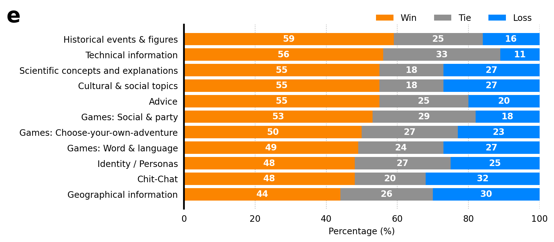
Stacked bar plots are used to show part-to-whole relationships. Each bar represents a total, while the segments within it show the proportion of each sub-category. To make the plot easier to interpret, it’s a good idea to sort the bars by one of the categories (e.g., “Win” percentage).
import numpy as np
import pandas as pd
import seaborn as sns
import matplotlib.pyplot as plt
from scipy import stats
from matplotlib.patches import Patch
from matplotlib.lines import Line2D

# --- Style and Color Configuration ---
# Display figures in higher quality for notebooks
%config InlineBackend.figure_format='retina'

palette = {
    r'BERT$_{base}$': "#b1d9ff",
    r'BERT$_{large}$': "#76bdff",
    r'RoBERTa$_{base}$': "#3ba1ff",
    r'RoBERTa$_{large}$': "#0085ff",
    "NeoBERT": "#fb8500",
    "Win": "#fb8500",
    "Tie": "#909090",
    "Loss": "#0085ff",
}

# --- Generate Stacked Bar Plot Data ---
# This data represents win/tie/loss percentages for different categories.
stacked_data = {
    'Category': [
        'Advice', 'Chit-Chat', 'Games: Choose-your-own-adventure', 'Games: Social & party',
        'Games: Word & language', 'Identity / Personas', 'Cultural & social topics',
        'Geographical information', 'Historical events & figures',
        'Scientific concepts and explanations', 'Technical information'
    ],
    "Win": np.asarray([55, 48, 50, 53, 49, 48, 55, 44, 59, 55, 56]),
    "Tie": np.asarray([25, 20, 27, 29, 24, 27, 18, 26, 25, 18, 33]),
    "Loss": np.asarray([20, 32, 23, 18, 27, 25, 27, 30, 16, 27, 11])
}
df_stacked = pd.DataFrame(stacked_data)

# --- Prepare and Sort Data ---
# Order the categories based on the "Win" data for clearer visualization.
df_stacked = df_stacked.sort_values("Win", ascending=True).reset_index(drop=True)

# --- Create the Figure ---
fig, ax = plt.subplots(1, 1, figsize=(10, 4), tight_layout=True)

# --- Plot Stacked Bars ---
# Stack bars for each category, plotting each segment on top of the previous one.
ax.barh(df_stacked['Category'], df_stacked['Win'], color=palette["Win"], label='Win')
ax.barh(df_stacked['Category'], df_stacked['Tie'], left=df_stacked['Win'], color=palette["Tie"], label='Tie')
ax.barh(df_stacked['Category'], df_stacked['Loss'], left=df_stacked['Win'] + df_stacked['Tie'], color=palette["Loss"], label='Loss')

# --- Add Bar Labels ---
for rect in ax.patches:
    if rect.get_width() > 5.0:
        ax.text(
            rect.get_x() + rect.get_width() / 2.0,
            rect.get_y() + rect.get_height() / 2.0,
            f"{rect.get_width():.0f}",
            fontsize=10, ha="center", va="center", color="white", weight='bold'
        )

# --- Style and Customization ---
ax.set_xlabel("Percentage (%)")
ax.set_ylabel("")
ax.set_xlim(0, 100)
ax.tick_params(left=False, bottom=False)
ax.spines[["top", "right", "bottom"]].set_visible(False)
ax.spines["left"].set_linewidth(2)
ax.xaxis.grid(True, which="major", linestyle=":")
ax.set_axisbelow(True)
ax.legend(loc='upper right', bbox_to_anchor=(1, 1.1), ncol=4, frameon=False)
ax.text(-0.5, 1.1, "e", fontsize=24, fontweight="bold", ha="left", va="top", transform=ax.transAxes)

# --- Save the Figure ---
plt.savefig("stacked_bar.png", bbox_inches="tight", dpi=300)
plt.savefig("stacked_bar.pdf", bbox_inches="tight")
plt.show()
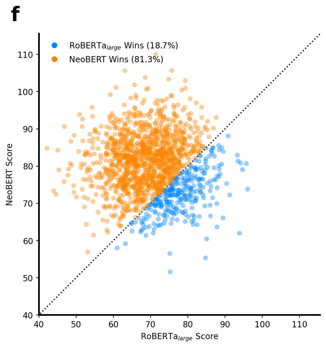
Pairwise Comparison Scatter Plot
This plot offers a direct, point-by-point comparison of two models’ performance. Each point represents a single data instance, and its position shows the score from each model. A diagonal line (y=x) acts as a reference: points below the line are “wins” for the model on the x-axis, and points above are “wins” for the model on the y-axis.
import numpy as np
import pandas as pd
import seaborn as sns
import matplotlib.pyplot as plt
from scipy import stats
from matplotlib.patches import Patch
from matplotlib.lines import Line2D

# --- Style and Color Configuration ---
# Display figures in higher quality for notebooks
%config InlineBackend.figure_format='retina'

palette = {
    r'BERT$_{base}$': "#b1d9ff",
    r'BERT$_{large}$': "#76bdff",
    r'RoBERTa$_{base}$': "#3ba1ff",
    r'RoBERTa$_{large}$': "#0085ff",
    "NeoBERT": "#fb8500",
    "Win": "#fb8500",
    "Tie": "#909090",
    "Loss": "#0085ff",
}

# --- Generate Main Results DataFrame ---
# This DataFrame simulates multiple runs of different models on various benchmarks.
data = {"Model": [], "Benchmark": [], "Score": [], "Run": []}
models = [r'BERT$_{base}$', r'BERT$_{large}$', r'RoBERTa$_{base}$', r'RoBERTa$_{large}$', "NeoBERT"]
benchmarks = ["CoLA", "SST-2", "MRPC"]
for i, model in enumerate(models, 1):
    for benchmark in benchmarks:
        # Simulate scores for 500 runs per experiment
        scores = np.random.normal(loc=i * 10 + 30, scale=8, size=500)
        data["Score"].extend(scores)
        data["Model"].extend([model] * 500)
        data["Benchmark"].extend([benchmark] * 500)
        data["Run"].extend(range(500))
df_results = pd.DataFrame(data)

# --- Reshape Data for Pairwise Comparison ---
# We pivot the results DataFrame to get scores for two models side-by-side.
# We create a unique index from both "Run" and "Benchmark" to avoid the reshape error.
model1 = r'RoBERTa$_{large}$'
model2 = 'NeoBERT'
df_pair = df_results[df_results["Model"].isin([model1, model2])]
df_pair = df_pair.pivot(
    index=["Run", "Benchmark"], columns="Model", values="Score"
).reset_index()

# --- Create the Plot ---
fig, ax = plt.subplots(figsize=(6, 6))

# Determine color based on which model has a higher score (a "win").
wins_model2 = df_pair[model2] > df_pair[model1]
colors = [palette["NeoBERT"] if win else palette[r'RoBERTa$_{large}$'] for win in wins_model2]

sns.scatterplot(
    data=df_pair, x=model1, y=model2,
    ax=ax,
    c=colors, # Use the win/loss colors
    alpha=0.4, s=35, edgecolor="none", legend=False
)

# --- Add Context and Styling ---
# Add a diagonal y=x line for reference.
max_val = max(df_pair[model1].max(), df_pair[model2].max()) * 1.05
ax.plot([0, max_val], [0, max_val], ls=":", c="k", zorder=0)

ax.set(
    xlabel=f"{model1} Score",
    ylabel=f"{model2} Score",
    xlim=(40, max_val),
    ylim=(40, max_val),
)
ax.spines[['top', 'right']].set_visible(False)
ax.set_aspect('equal', adjustable='box')
ax.spines["left"].set_linewidth(2)
ax.spines["bottom"].set_linewidth(2)

# --- Create a Custom Legend ---
win_pct_model1 = (df_pair[model1] > df_pair[model2]).mean()
win_pct_model2 = (df_pair[model2] > df_pair[model1]).mean()
legend_elements = [
    Line2D([0], [0], marker='o', color='w', label=f'{model1} Wins ({win_pct_model1:.1%})', markerfacecolor=palette[model1], markersize=8),
    Line2D([0], [0], marker='o', color='w', label=f'{model2} Wins ({win_pct_model2:.1%})', markerfacecolor=palette[model2], markersize=8)
]
ax.legend(handles=legend_elements, loc='upper left', frameon=False)
ax.text(-0.1, 1.1, "f", fontsize=24, fontweight="bold", ha="left", va="top", transform=ax.transAxes)

# --- Save the Figure ---
plt.tight_layout()
plt.savefig("pairwise_plot.png", bbox_inches="tight", dpi=300)
plt.savefig("pairwise_plot.pdf", bbox_inches="tight")
plt.show()
